Part 1
Part 2

Wednesday, 29 December 2010
Tuesday, 28 December 2010
Monday, 27 December 2010
Audience Feedback: Digipak Draft
Front cover:
- The title on the side 'Those autumn days' is difficult to read.
- Image itself is good and relates to the title of the album 'Those autumn days'.
- Text is placed well and doesn't distract from the image.
- Font doesn't look very effective.
- The artist is in the image so audience can recognize.
Inside:
- The placement of the guitar image is well thought out.
- Hole of CD is hole of guitar.
- Image of mike is good photograph.
-The title on the side is hard to read again 'Those autumn days'.
- The industry logo good, not in your face.
- The images again reflect the album title, 'Those autumn days'.
CD:
- Text fits into guitar nicely.
- Image reflects album, 'Those autumn days'.
- Font doesn't link with magazine advert.
- Links with image under CD (inside cover)
- Font looks bland.
Back:
- Image is a good photograph.
- Text on the side different colour to the rest of the CD.
- Text in image is readable, good and clever.
- Title on the side is clear in this image, 'Those autumn days'.
- Text and barcode make the cover look realistic.
- Too much text on back.
- Image again reflects album, 'Those autumn days'.
- Industry logo included which is good.
Thursday, 23 December 2010
Digipak Text Draft
After creating a draft of images we could use we then decided to create a draft of the text format. This is to see where the text would set in the images and how it would fit. We also had to get the right colour for the text. The fonts we downloaded for the magazine advert are on the mac in college and as it's the holidays we can't get access to them.


Sunday, 19 December 2010
Digipak Draft
Draft of the digipak images: What we're using, how we'll cut the images and size. We will edit the images better later but this is just a rough idea of what we'll be doing. We will also add the typography at a later date. The typography will be the same as use on the magazine advert so the link is more obvious.
Front Cover
Front Cover

Inside Covers

CD

Back Cover

Friday, 17 December 2010
Research Home Video Style
Ellis Goulding's video for her cover of 'Your song' represents the idea of what we want to use for the home video style of the music video. We will be using this effect in the instrumental of the song we are using. The time of the instrumental is 30 seconds roughly, so we will record alot more so we can cut it all down.
In this video we also see lots of random short shots to give the idea of memories. The random shots often link together or link to the story. For our video we will include links such as a prospectus and suitcases to show they are going away.
The ending of Scrubs also shows the home video style footage. The grainy effect on the video reinforces the idea of home video. In this scene however, it is different as the grainy effect makes the footage look old but the video is meant to be JD looking into the future.
Thursday, 16 December 2010
Filming!
Today we went filming to Bristol, we were filming the train journey for the bus scenes on the storyboard. We also got the handi-cam footage done today while in Bristol.
We had a few problems as Mike forgot his SD card and ipad so we had no way of recording the footage or being able to mime intime. We decided to go to tesco's and Mike brought a 4BG SD card so we could film, instead of going all the way back to his house, and he used his ipod in the shots to he could tell when he was in time. This might not look good though as he is singing, playing the guitar and listening to an ipod.
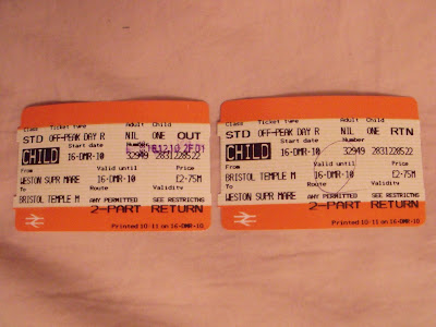
We decided to film on the train instead of the bus as it would be more steady and there would be more room to film. This was limitied time as a train to Bristol from Weston-super-Mare is rounghly 30 minutes, we had to get 9 shots done including the speeded up footage for the effect. Luckily, we managed to get it all done just in time.
Mike and Vanessa then went round Bristol filming their day for the handicam footage. They got some good shots but we will have to edit them after christmas now.
We had a few problems as Mike forgot his SD card and ipad so we had no way of recording the footage or being able to mime intime. We decided to go to tesco's and Mike brought a 4BG SD card so we could film, instead of going all the way back to his house, and he used his ipod in the shots to he could tell when he was in time. This might not look good though as he is singing, playing the guitar and listening to an ipod.
We decided to film on the train instead of the bus as it would be more steady and there would be more room to film. This was limitied time as a train to Bristol from Weston-super-Mare is rounghly 30 minutes, we had to get 9 shots done including the speeded up footage for the effect. Luckily, we managed to get it all done just in time.
Mike and Vanessa then went round Bristol filming their day for the handicam footage. They got some good shots but we will have to edit them after christmas now.
Tuesday, 14 December 2010
Magazine Advert Changing
We decided to change our advert as our audience said the date font size looked misplaced and wrong. We tried altering the size, the positioning and the font but wherever it was, it didn't look right. We decided to just get rid of the date all together as this made the image look good and nothing looked misplaced. Here is the new final product.

Sunday, 12 December 2010
Saturday, 11 December 2010
Filming!
Saturday we went filming on location. We were filming on Weston's beach although the weather wasn't on our side as the sun wasn't out. However, we managed to get everything filmed for that location.
We spent a lot of time with the tracking scene as we couldn't get the camera to stay straight enough. We tried walking with a gorilla stand, walking with just the camera and putting the camera on a push chair. We finally decided to keep the camera still on the stand and zoom out slowly to give the effect of tracking. If we had access to a dolly we would have used one.
Overall, a productive day of filming.
Friday, 10 December 2010


Feedback On Magazine Advert
We got the other media class to look at our magazine advert and voice their opinions on the image and to gain feedback on what we can improve.
They said they liked the 5 stars and quote from the magazine we made 'Acoustica'.
They liked the different fonts on the advert but they said the size's need to be re-thought as the bottom line doesn't look too aesthetically pleasing.
By taking this on board we will improve what we can to our magazine advert.


More Feedback For Video!
We showed our music video so far to the other media group and got the response from the target audience, mid-late teens.
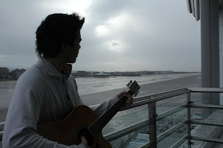
They liked the style of the video, part narrative, part performance. However, the performance wasn't very convincing to some people especially the strumming of the guitar. We find this hard to work on as the actor playing the artist doesn't know how to play guitar properly. We will try and focus on doing more CU shots to avoid the guitar playing being noticed.
They also 'aww-ed' at the romantic scenes in the video which showed good response as they are relating to the character and feeling sympathy towards the artist.
Thursday, 9 December 2010
Filming!
We went back to the park location to re-film a few shots that we weren't satisfied with. Today, the weather decided to be sunny and bright, which wasn't what it was liked when we filmed last time.
We changed the ISO and the shutter speed of the camera to make the image much darker so it isn't too different. The shots are much better and look better than the previous ones.
We also edited the footage in the lesson and showed it to the other media class to get feedback.
Wednesday, 8 December 2010
Feedback so far
We have just started editing our video footage and we are about minute into the music video. Earlier we received some comments and feedback from other groups and our teacher on our progress so far. These are some below

These feedback will be helpful as we can see what the audience think of the video already, before it is finished. so then we can make changes on the aspects that need changes both in the editing and filming.

These feedback will be helpful as we can see what the audience think of the video already, before it is finished. so then we can make changes on the aspects that need changes both in the editing and filming.
Tuesday, 7 December 2010
Editing
In todays lesson we were editing the footage we filmed on thursday. Most of the shots were good but we want to re-do some of the shots as we aren't completely satisfied with the result.
Our next aim is to film on thursday the shots we want to do and then on saturday film the bus seen. We decided to change the bus seen to train as we thought this would be alot easier to do and would effect less people who aren't participating in the footage.
We also tried the colour correction editing on a few of the shots. We feel that unless we can get it perfect it wont look right. We will be looking for alternate ways of editing this effect to make it look more professional.
Friday, 3 December 2010
Thursday, 2 December 2010
Filming
Today we went filming on our second location, Ashcombe Park.
Although the weather was againsts us we held up through the cold and filmed most of what we needed. Unforunately, we didn't have enough time to film everything in that location so we will be returning there A.S.A.P
Although the weather was againsts us we held up through the cold and filmed most of what we needed. Unforunately, we didn't have enough time to film everything in that location so we will be returning there A.S.A.P
Magazine Advert - Magazine
We created a magazine title for the quote on our advert, we called this 'Acoustica Magazine'. We felt this fitted well with the genre of music and so it would be more likely to appear in this type of magazine.
Here is a rough idea of what the magazine front cover would look like.
 We feel this represents the genre well and would be a good way of distributing our artists album.
Here is a rough idea of what the magazine front cover would look like.
We feel this represents the genre well and would be a good way of distributing our artists album.
Wednesday, 1 December 2010
Magazine Advert - Record Company

For our album advert we decided to create our own record company name and logo. The record company we created will represent our artist. We thought how record companies have random names. According to Wikipedia, the major labels since 2009 are: Sony Music Entertainment, EMI Group, Warner Music Group and Universal Music Group. We decided on a random animal to be our record label; 'Leopard' was what we decided to use for our company.
We didn't feel obliged to link our record label to our music genre as labels gather so much talent they aren't defined by who they represent.
Magazine Advert

 As you can see the original image isn't very aesthetically pleasing. By altering the shadows and highlights we created a more cinematic image. We decided to use two separate fonts to identify the artist name 'Chase Coy' from the album title, 'Those autumn days'.
Tuesday, 30 November 2010
Typography
For our ancillary task we need to create a digipak for the CD and a magazine advert. One way we will link these seperate promotional works is with the text.
We experimented with different typography on word and we ended up downloading a few offline too. These are a few we looked at:

Monday, 29 November 2010
Filming
On the 28th Of November we went filming to Mike's house. We filmed the shots that needed to be done there. We decided filming each location separately was the best way to do it.
Vanessa Wall was able to play the part of the romantic interest for our music video. Luckily, she was a fan of Chase Coy too and was very helpful when it came to filming.
The filming overall took about an hour and a half and we were filming two difficult parts of the video. We filmed the effect of the slow down but still in sync footage which took several takes as Mike had to play and sing in double speed. The other difficult shot was the opening scene, this is where the guitar plays itself. After figuring out the strum pattern we managed to capture it after a couple of takes.
Overall, it was a successful shoot and we managed to get all the footage we needed from that location. Next, we will be filming on location in Ashcombe park, we will be getting all the shots we need from here and then, like we did for the first lot of the shots, we will edit what we have so far so the editing wont take as much time.
Saturday, 27 November 2010
Thursday, 25 November 2010


Tuesday, 23 November 2010
Feedback On Photoshop
We showed the 'disaster' to some other people to make sure we weren't being to critical on the image. We found that they also agreed with us and that the image didn't seem to look nice. The colours didn't blend well and it was over-edited. We decided to go on another shoot and try simpler ideas for the ancillary tasks.
Photoshoot Disaster
Unfortunately, when it came to editing our images from the photoshoot we realized they didn't look good enough. We decided to go out on another shoot to get better, more professional looking images.

We spent the lesson on photoshop trying to make the image look good enough but we were still unhappy with the outcome. Next lesson we will be re-designing our digi-pak and going out on a photo-shoot.
Monday, 22 November 2010
Saturday, 20 November 2010
Filming Notes
Mike's House: 12 shots (Greyscale effect) (Slow motion syncing effect) (Fading effect)
Beach: 19 shots (Slow motion syncing effect) (Fading effect)
Park: 11 shots (Greyscale effect) (Slow motion effect) (Fading effect)
Bus: 11 shots (Greyscale effect) (Slow motion effect) (Fading effect)
Handi-cam: 30 seconds of footage over instrumental
Various links- Results (University), Holding up prospectus', Memories of the two characters in the previous locations.
Thursday, 18 November 2010


Tuesday, 16 November 2010
Photoshoot Planning for Digi- Pack
Next lesson we have decided to go on a photoshoot in weston woods, as this location has relevant scenery to the singer/song writer genre of our song. The location is ideal as it provides appropriate aesthetic elements that relates to similar themes in this genre.
Sunday, 14 November 2010
Chase Coy CD Covers


 By looking at covers Chase Coy has used for his music we can see how he represents himself and his music. In the images he looks quite laid back so we want to show this idea in the shoot we do for our digipak and magazine advert.
He also doesn't look at the camera in any of the covers. Natural lighting is used in most of the images also, the sun is seen in them.
Thursday, 11 November 2010
Effects Test
Colour And Black And White
This effect was alot more difficult to get our heads around. After, messing about with the programme (final cut pro) we managed to create this effect of greyscale and colour.
We want to look at different ways of doing this as when Mike moves in the film the coloured part stays the same. We need to figure out away of using a mask to only make Mike stand out.
Wednesday, 10 November 2010
Sin City Effect
 Sin City is a well known film featuring many famous actors/actresses. The effect used throughout the film has caught our eye and we wanted to test it to see if we could produce something similar.
As you can see the effect is using greyscale with limited colour. The effect is outstanding and looks amazing even on a photograph. We like how the significance of the object is shown by making it stand out from the rest of the scene.
We thought we could use this to show the memories. Have the singer appear in colour and the rest of the frame would be in black and white. It shows the character is crossing to a memory/better time. We also thought this effect would show memory well and would work well with the storyline.
Tuesday, 9 November 2010
MTV EMA Awards 2010
The MTV EMA awards has recently just finished. On November 7th they held this well known music awards ceremony in spain, madrid.
The best music video award went to Katy Perry feat. Snoop Dogg - California gurls
Although this music video is very abstract and different to our ideas it shares some similar conventions. The idea of narrative mixed in performance is scene in this award winning video, we also hope to include this idea of narrative and performance.
Monday, 8 November 2010
Lip Syncing
We created a short video to test out lip syncing. We used Gary Jules' 'Mad World' to test music syncing and lip syncing. We used this song as like ours it's slow and meaningful rather than fast shots.
The video is only simple and short as its only just and experiment to show how lip syncing works and if it will look right when our actor mimes.
Saturday, 6 November 2010
Effects Test
Fading Away
For the ending of the memories shots we wanted the girl to fade, to show the singer is coming back to reality. We wanted to experiment with how to create this simple effect. We are also using it to show the two of them going their own ways.
For the ending of the memories shots we wanted the girl to fade, to show the singer is coming back to reality. We wanted to experiment with how to create this simple effect. We are also using it to show the two of them going their own ways.
Wednesday, 3 November 2010
Evaluation So Far
How does your media product use, develop or challenge the forms and conventions of real media products?
Our media product is conventional to a singer/songwriter music video as it incorporates performances with a narrative. Although, it's hard to say what is conventional when it comes to music videos. This is because you can do almost anything and use different ideas to produce a final product. However, some people say that everything has already been done so it makes it hard to create an original piece. Looking at other singer/songwriter's videos we saw that there are some conventions associated with this genre: Scenic views, bright colours and very natural mise en scene. We used and challenged these conventions, such as using a beach at sunset for various shots and we challenged it by using mundane locations.
How effective is the combination of your main product and ancillary texts?
We hope that our music video and ancillary texts are linked together. We plan to use the same actor in both the main product and the ancillary texts so the audience can associate him with the song. Our idea for the back of the CD cover is a notebook with the song titles written on as this is conventional to a singer/songwriter.
What have you learned from your audience feedback?
We used audience feedback to justify a target audience. We interviewed various people and looked on social networking sites to find who he most aims at. We found that his main audience are teenagers, but others like his music too. This is because his lyrics can be related to well, by many different people.
How have you used new media technologies?
During our research we have used various new media technologies. We used prezi to help show our research for music videos and singer/songwriters.
Monday, 1 November 2010
Animatic Audience Feedback
We found that most people would recognize black and white as a past time. This is because it's the norm and used in most films and videos.
However, Some people liked the artistic idea of the colour being the memory, as the world is brighter with someone you love. They thought it might be too complex however for a music video. They thought it made more sense this way but it is more conventional for the memories to be black and white.
We want to experiment with the idea of trying to incorperate a mixture of colour and greyscale. Looking at the film 'sin city', we liked the way throughout the film, only significant items/things were in colour while the rest of the footage is black and white.
Overall, the audience said that the animatic fitted well with the song. It didn't need quick shots beacuase the song is slow paced.
Thursday, 28 October 2010
Animatic
Version 1
This version shows the memories in full bright colour. This I thought, would appear more articulate as it shows he is most brightest when with his love. When he is alone it is dull and bleek.
Version 2
This version shows the memories as 'half greyscale' to show the deterioration of the memory over time. The moment in the present is in a brighter colour to show that the moment in time is real.
Wednesday, 27 October 2010


Subscribe to:
Comments (Atom)