
Tuesday, 12 April 2011
Dear Moderator...
Friday, 4 February 2011


Thank You For Reading!
AWARDS
 We decided as a class to hold an awards event. The categories were:
Best Video Overall
Best Video Class 1
Best Video Class 2
Best Narrative
Best Use Of Special Effects
We won best narrative performance out of all the music videos created!
We came second in Best Vdeo Class 2 and Best Video Overall!
Finally, We Came 5th In Best Male Performance And Use Of Special FX!
Overall a good result!
(:
Thursday, 3 February 2011
Our Response To The Project
Wednesday, 2 February 2011
Evaluation Question 4
During this project we experimented with various use of technology. This ranged from hardware (Camera, ipad) to software (Finalcut Pro, Prezi). Along the way we have gained new techniques and learnt from mistakes.


 We were also able to create the 'slow motion syncing' effect using Final cut pro but we didn't use this idea in our final cut. We and the audience felt that it was too much of a 'Filler' and didn't really hold any association to the story.
 Evaluation Question 3
Our audience feedback is very significant to our music video and ancillary tasks. Without the feedback gained we wouldn't have noticed certain mistakes or that some shots didn't work. (Performance of slow motion syncing effect)
We noticed that as a genre singersongwriter is usually appreciated by the majority of people. The older age category like the mellow sounds and enjoy listening to calm relaxing music and the young teens like to hear lyrics that relate to their life. The females gave a much better feedback to the video as they felt more sympathetic to the video and the artist is male, attracting females.


Original image to our inital idea for magazine advert image. This is from our second shoot. The audience feedback helped us make our advert appeal more to the target audience.


Our first font cover didn't turn out well. Our audience agreed that it was just too much. We then simplified the image; more like Chase Coy's actual covers. We added text into the image just to see where the text would go. This fitted well but we made some alterations as the audience felt colour and position could be changed.

Our final design for our front cover of our digipak. We changed the other parts of the digipak from the audience feedback also. We used the same typography as we did for the magazine advert. This showed links between the products which the audience noticed well.


From our feedback we were told that the train scenes appeared too dark and so the audience couldn't see him singing. We had to shoot towards the light and this is why the footage came back underexposed. After getting the feedback we then used 'colour correction 3-way' to alter the brightness. This made the clip more clearer and the audience felt the improvement made the video flow more.


We also got feedback that said the scene with the slow motion effect was too much of a filler. Here we decided to go out filming again and so filmed more performance. This made the video flow more and keeps the performance and story going. The 'filler' section dragged on the video too much but now the video is smooth.
Evaluation Question 2
Overall we feel the combination is very effective and shows clear links. The links between each product signifies to the audience the relationship between the promotion package.
As a promotion, the products work well together and compliment each other. First the audience would see the magazine advert, then relate it to the album and finally see the video.
We feel the simpleness of each text is mirrored between each other. The lack of 'special effects' really reflects on the style of singer/songwriter also as it's very basic, a voice and a guitar.
Tuesday, 1 February 2011
Evaluation Question 1
We have also collected a few screen grabs that show a similarity between different media texts.

This shows a similar use of lighting in both Ellie Gouldings 'Your song' and our music video. We feel this effect of lighting gives a real dramatic feel to the shot and links well to the lyrics of the song we used. Unlike Goulding however, we have placed the artist in the middle of the shot instead of the right third. This puts more ephasis on the artist.


Again we are looking at 'Your song' covered by Ellie Goulding. We noticed that Goulding's video portrayed more mundane locations like our video. We discussed how this was less conventional to this genre style. Here the shots are similar as the framing shows the artist on the right side with the train window in the other two thrids of the frame.


In James Morrison and Nelly Furtado's 'Broken strings' music video. we see Morrison pick up the guitar which is sat next time him. We used this idea in our music video to link the guitar playing itself to the performance. Our shot of this event is in the same frame as the previous effect and not a MS of the artist.


Our opening and ending of the music video is of the guitar playing itself. We were inspired by the 'Confused.com' advert which showed a guitar playing itself. The strings move on their own. We created this idea but using framing we managed to show the strings playing themselves without making the technique too difficult for us. The idea of the guitar playing itself symbolizes the idea that things (relationship) carrys on even when seperate from artist (each other). We used this technique to book-end our video making it feel more complete.
Female Character/Relationship Representation.


In our video we use a female character who is the singers girlfriend. We looked at how the 'perfect' female is based around the idea of blonde hair and blue eyes. Here we have looked at Drew Barrymore in '50 First Dates', portrayed as a smart blonde how can be a bit ditzy. Bright colours make the blonde stand out more. Keira Knightly in 'Love Actually', more of a mellow blonde, shown with slim figure and comfortable/fashionable clothes. Finally, Jessica Alba in 'Valentines Day', he blonde is alot more of a 'bleach blonde' which makes her face look more pale and her features are hightened.
The media usually represents females as feeble, innocent and weak yet we often see a sense of voyerism in popular music videos, especially R&B. Being a singersongwriter, we looked at romantic and rom-com films as this shows conventionally, the idea of the perfect couple. They have fun together and 'fit' together like a puzzle. This relationship is seen throughout the video and the audience agreed as they would "aww" at some scenes and there was talk of "the cute babies they would make". Our representation of the movie industries couple is obvious in the video and is successful.
Evaluation Presentation Ideas
Monday, 31 January 2011
Evaluation Presentation Ideas
I will be presenting question one from the evaluations and I will create it in the form of a commentary voice over shown with the final cut.
Sunday, 30 January 2011
Evaluation Presentation Ideas
Saturday, 29 January 2011
Evaluation Presentation Idea
Friday, 28 January 2011
Youtube Response
 Our video was featured by Youtube which we were very pleased about. We are deffinately proud of our video and have tried to show as many people as possible what we can do when our mind is set.
Thursday, 27 January 2011
Chase Coy's Response
 I sent the link to chase coy on his facebook page. I thought we should thank him again for letting us use his music and thought he'd like to see the final product.
As you can see he thought it was 'Awesome.'
Lesson Summary
We also hope to film more 'response' videos so we can create a mash up video of different ages/genders responding to the final cut. We managed to film one response of the main target audience, young females.
Wednesday, 26 January 2011
Storyboard vs Final Cut


The opening shots turned out as we planned and look pretty much the same.


For this shot we had to change the angle of the camera as we felt the framing this way was alot more effective.


For this we decided to show a CU of mike missing the girl instead of him carrying on playing on ther piano.


This shot was very much the same as what we originally planned. The shot is very successful as the framing of the scene is effective as it foreshadows where the story will lead.


We changed the location from our first plan and so we filmed the train instead of the bus.


We changed this scene as the actors didn't feel too comfortable sharing a kiss. The scene still fits with the story though.


Tuesday, 25 January 2011
Audience Feedback On Final Product
This was just to see if the video was successful and is redunant to the audience and rather than entropic. We feel the video is conventional in parts and unconventional in others. Here is what they said:
Other Media Class:
-Some shots of guitar still not in sync
-Guitar shots are good
-New scene of sunset fits nicely
-Runs smoothly without a 'filler'
-Story is clear
New Viewers Of Video:
-Liked fading effect
-Liked Guitar shots at start and beginning
-Liked handicam section of video
-Could have had a bit less going on in the background
-Not many shots of artist playing the guitar
-Could have had a 'master performance' in one space
Youtube Viewers:

Monday, 24 January 2011
Evaluation Question 4)
How have you used new media technologies?
- Camera (HD)
- Prezi (Research)
- Garageband
- Final Cut Pro
- Photoshop (Digipak/Mag ad)
- Photoplus x3 (Animatic)
- Movieplus x3 (Animatic)
- iPad
The HD Camera allowed focus pull effect which we wanted to use. Strong depth of field was also created using the camera. We could also change the ISO number therefore brightening/darkening the footage.
We had an idea to use the Sandi Thom music video effect, Slow motion but in sync. Final Cut Pro allowed us to create this effect however, we decided not to use this effect for our final cut as the audience suggested it was too much like a 'filler'. We used Garageband to help with this as we had to film Mike singing and playing at double speed. We cut part of the song that we wanted to edit and then sped it up, we then exported this to Mike's iPad so he could mime to it when in location.
The flashback effects we found on Final Cut Pro we decided not to use these however as we felt they were too, 'studenty' and 'gimmicky'. We used the fading technique to show the flashback merge with reality like a memory drifting through our minds. The fading was a simple effect that was able in Final Cut.
Unfortuantely, we didn't have a dolly and so tracking shots would be 'shakey'. We decided to use the zoom on the HD camera but slowly. This would give the effect of tracking back which is what we wanted to achieve.
We used Final Cut Pro for the editing of the video but encountered some technical problems while in post-production. The redering of the footage became a nuisance as it took time to render. The playback wasn't great either as the files were big and therefore when we tried to edit the footage would sometimes 'jump'. The only other issue was the exporting time, as the files were HD and large it took a long time to save them as Quicktime files.
For the Digipak and the Magazine advert we used Photoshop to edit the images. We edited the shadows/highlights and the brightness/contrast. This helped make the image appear more cinematic to its previous asthetics. We also downloaded fonts that were used in both ancillary tasks and kept the colour scheme throughout.
During our research we found new ways of presenting our findings. Using Prezi and Wordle we could show our technical skills in IT and it makes the Blog more visual. We used social networking sites such as: Myspace, facebook and twitter to gather some information on audience and other things.
The animatic was done using Photoplus x3 and Movieplus x3. Using a grafics tablet we edited the storyboard hand drawn. We did this by colouring in the images. After edited we piece it all together using the movie software and created the animatic.
Sunday, 23 January 2011
Evaluation Question 3)
What have you learned from your audeince feedback?
Audience Research: Who likes the song?
Pitch and the feedback
Animatic Feedback
Video Feedback: First lot of editing
Video Feedback: Second lot of editing
Feedback on Magazine advert
Digipak Feedback
Feedback on Rough Cut
Feedback on flashback effects
How we improved each step of the way thanks to the audience feedback.
Pitch = Can finalise ideas and work on blogger work to prepare for the video.
Animatic = How we can improve the 'actual' video from the animatic. What effects the audience feels fits with the story idea.
Video = Improving the working progress and seeing what works and what doesn't to others opinions. Taking on board the audience feedback and listening to what they say and correcting our video from what they felt didn't work so much.
Magazine Advert = Changing order and text size. We also got rid of some parts of the text as the audience felt it didn't look right.
Digipak = Doing another shoot. Re-editing the photographs so they appear better. Moving and changing the typography.
Flashback effects = Taking on the audiences opinion we decided an effect wasn't specifically needed in our video and so stuck to no filter but the fading effect at the end of the 'memory'.
Friday, 21 January 2011
Evaluation Question 2)
How effective is the combination of your main products and ancillary texts?
Magazines advert + Digipak + Music Video.
Artist appears in all three. (Mike)
Typography is same for the ancillary tasks.
The colour scheme for the ancillary tasks is the same.
The song 'All those nights' and it's lyrics fit with the album title 'Those Autumn Days'.
The photographs link well with the song and the album title.
Mise en scene (Clothes and guitar) are the same throughout.
Unfortunatley, there is no scene in the video with autmn scenes or leaves on the ground.
Girl doesn't appear in the ancillary tasks but, we decided to focus on the artist.
Evaluation Question 1)
How does your media product use, develop or challenge the forms and conventions of real media products?
Forms and conventions of music video = Close ups for emphasis on artsit. Singing in sync to the music and instruments in time. Match on audio. No actual conventions as music video can be created however.
Forms and conventions of Singer/songwriter = Write. Compose. Heart throbs. Experiences. Love, Romance. Acoustic. Guitar, Piano. Solo.
Challenging conventions!
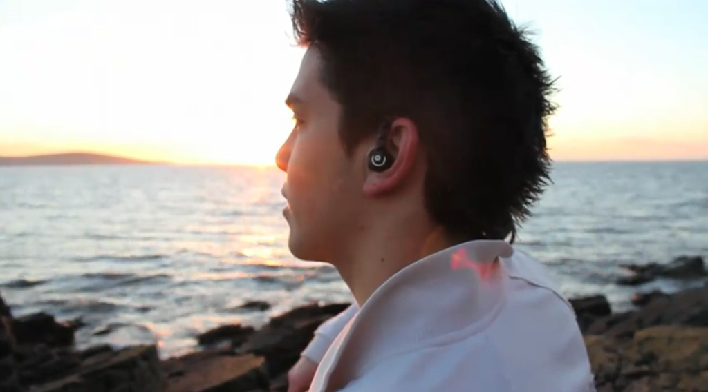
Locations = The locations are mundane as its 'the little things you remember' mostly. Although, we ended up using a very conventional scene on the sea front at sunset however, this scene didn't include any 'love' between the two characters. It was just a performance shot.
Thursday, 20 January 2011
Editing
We did put alot of effort into the slow motion syncing effect but decided it really didn't look appropriate and wasn't 'needed'. We simply filmed the artist Chase coy/Mike singing and playing to the music in a scenic sunset location.
There is no fading in this scene as we felt the handicam footage is the flashback to this piece.
Now that the video is complete we will put it onto the blog in our next lesson as the uploading takes a long time.
Wednesday, 19 January 2011
Tuesday, 18 January 2011
Evaluation Presentation Ideas
Audio commentary over final cut
Audio commentary over images (after video)
Question 2)
Prezi
Question 3)
Video
Google Sketchbook
Extra Filming!

Saturday, 15 January 2011
Final Flashback Idea
Friday, 14 January 2011
Feedback On Flashback Effects
Thursday, 13 January 2011
Colour Correction
 We used colour correction 3-way to edit the underexposed scenes. We brightened the footage so it doesn't show much difference between the other location shots.
Flashback Effect
Wednesday, 12 January 2011
Digipak Complete


We decided that we wanted to show the design in an actual CD case so that we could get proportions and allignment correct.